Friday, October 5, 2012
Junk Charts
I was typing in a web address in my browser, and one of the auto-complete suggestions was for Junk Charts, a blog about bad figures found in the wild. I had visited it a while back but forgotten about it. Check it out for some particularly egregious examples of chart junk.
Tuesday, September 11, 2012
Tuesday, September 4, 2012
Visual Strategies
Check out this brief review of a new book on scientific figure design, Visual Strategies, in The New York Times.
Thursday, May 17, 2012
multiple colormaps in matlab
How do I use multiple colormaps in a single matlab figure? This is probably one of the biggest frustrations that almost all matlab users have to deal with. I would argue that this shortcoming of matlab --- combined with the default jet colormap --- have led to an entire generation of ugly scientific figures.
I used to use freezeColors and cbfreeze to make plots and colorbars with different colormaps. However, now that I use export_fig regularly, these do not work. (The incompatibility has to do with different renderers. Export_fig uses the painters renderer (aka. "the good renderer") but freezeColors does not allow the painters renderer to be used.)
My (super awesome) officemates, Nick and Noel, have come up with a solution for this problem. They use the fact that contourf essentially plots separate patch objects for each level of the colormap. They extract the coordinates from contourf and then manually plot each layer as a patch object with a specified color. This way, they avoid using a colormap entirely when they plot the figure. Sounds more complicated than it is. Here's an example of some code that Nick wrote. (Hopefully, this will be turned into a function soon, but for now, you can use this as inspiration.)
%get the patch object handles:
%now you need to make a fake colorbar using the same trick:
%define the colorbar axes location just above the subplot you are working with:
lbwh=get(gca,'Position');
Tcb=axes('Position',[lbwh(1) (lbwh(2)+lbwh(4)+.005) lbwh(3) .04]);
%contourf your fake colorbar:
[con conhand]=contourf(cvec',[0 1],[cvec; cvec],cvec,'linecolor','none');

I used to use freezeColors and cbfreeze to make plots and colorbars with different colormaps. However, now that I use export_fig regularly, these do not work. (The incompatibility has to do with different renderers. Export_fig uses the painters renderer (aka. "the good renderer") but freezeColors does not allow the painters renderer to be used.)
My (super awesome) officemates, Nick and Noel, have come up with a solution for this problem. They use the fact that contourf essentially plots separate patch objects for each level of the colormap. They extract the coordinates from contourf and then manually plot each layer as a patch object with a specified color. This way, they avoid using a colormap entirely when they plot the figure. Sounds more complicated than it is. Here's an example of some code that Nick wrote. (Hopefully, this will be turned into a function soon, but for now, you can use this as inspiration.)
cvec=-.5:.5:10.5;
%make a "colormap"
%make a "colormap"
tcmap=flipud(cbrewer('div', 'RdYlBu',length(cvec),'linear'
%contourf it
[con conhand]=contourf(rgrid/1000,
%get the patch object handles:
p=get(conhand,'children');
thechild=get(p,'CData');
cdat=cell2mat(thechild);
%loop through and manually set facecolor of each patch to the colormap you made:
for i=1:length(cvec)
set(p(cdat==cvec(i)),'
set(p(cdat==cvec(i)),'
end
%%%%%%%%%%%now you need to make a fake colorbar using the same trick:
%define the colorbar axes location just above the subplot you are working with:
lbwh=get(gca,'Position');
Tcb=axes('Position',[lbwh(1) (lbwh(2)+lbwh(4)+.005) lbwh(3) .04]);
%contourf your fake colorbar:
[con conhand]=contourf(cvec',[0 1],[cvec; cvec],cvec,'linecolor','none');
p=get(conhand,'children');
thechild=get(p,'CData');
cdat=cell2mat(thechild);
% AGAIN, loop through and manually set facecolor of each patch to the colormap you made (this makes a horizontal colorbar):
for i=1:length(cvec)
set(p(cdat==cvec(i)),'
set(p(cdat==cvec(i)),'
end
%set the colorbar axes to whatever you want
set(gca,'yticklabel',[],'
I used a variation of this code to make some figures and it worked great. Here's an example:

Monday, May 14, 2012
Vaughn's presentation on Dynamic Figures
Thanks so much to Vaughn who gave a super informative presentation about dynamic figures! I'm really looking forward to learning some of the tools that he told us about. Click here to see his presentation, which was made using the same tools one would use to make a dynamic figure. It should just display in your browser and use arrow keys to go from one "slide" to the next.
His main message was to use the following tools:
- JSON for data management
- svg
- coffeescript
- Lots of frameworks such as d3.js
His main message was to use the following tools:
- JSON for data management
- svg
- coffeescript
- Lots of frameworks such as d3.js
Wednesday, May 9, 2012
Figure club meeting on 10 May: Interactive Figures
Join us on Thursday, 10 May 2012 for our next figure club meeting. Vaughn Iverson will be talking about making interactive figures on the web and elsewhere. This should be a great session, so don't miss it.
4:30 PM, OSB 410 (note different room).
There will be a faculty candidate seminar immediately prior to our meeting (in a different room) and we'll wait to start until after that seminar is over. Some come to both events!
4:30 PM, OSB 410 (note different room).
There will be a faculty candidate seminar immediately prior to our meeting (in a different room) and we'll wait to start until after that seminar is over. Some come to both events!
Saturday, May 5, 2012
When you have a few minutes, be sure to check out chartsnthings, a fascinating blog that documents the creative process of producing New York Times charts and infographics. A typical post starts with a hand-drawn sketch of the initial idea and goes through the iterations leading to the final product that makes it into the print edition or online.
Wednesday, May 2, 2012
Meeting on Thursday, May 3
Hi everyone,
The figure club will meet on Thursday, May 3 at 4:30pm (immediately following the faculty candidate talk) in OSB 425.
We'll be doing figure critiques. Bring figures that you want to improve. For instance, if you can't decide what colormap to use, print out the figure with multiple colormaps and we can help you pick the best one. If you don't have figures that need critiquing, feel free to come anyway and to give others advice. Don't be intimidated --- the critiques are friendly!
Also, if anyone has "before" and "after" versions of figures they have made, I'd love to post them on this blog! Email them to me.
The following meeting will be on Thursday, May 10 at 4:30. The topic will be poster design.
See you tomorrow!
Wednesday, April 25, 2012
MATLAB tricks
The figure club met today to discuss tricks we use in MATLAB. Here's what we talked about.
(I hope that this discussion can remain ongoing into the future, so if you have MATLAB frustrations, ask your question as a comment here and hopefully someone will have a solution.)
Saving with export_fig
export_fig is a great way to save plots. Way better than "save" or "print" because it is a lot smarter. Personally, I like that it crops my figure. More info on the matlab central file exchange website.
Dropbox
Using dropbox to make matlab code the same on both a home and work computer. (Dan can you elaborate more on this?)
Edit Plot tip
Don't use Edit Plot tool in matlab. It does some funky things so you're way better off to write the code that will plot the figure in its final version.
File types
For vector graphics, save your figures as pdf or eps. For raster graphics, use png or tiff. Do not use jpeg because it compresses the file in a way that's only appropriate for photos and that will make the text in your figure very pixelated. I personally use pdf whenever possible because it preserves the text as text so it can be changed in a program like Illustrator. pdfs are also very robust, in other words, they will appear the same on any computer.
Labeling a colorbar:
Multiple colormaps:
freezeColors and cbfreeze are very useful tools from the file exchange. freezeColors will allow you to have multiple colormaps on one plot and cbfreeze allows multiple colorbars. Use the following syntax:
The end result is a figure that has two different colormaps!

Instead of pcolor: imsc
Dan really likes imsc to plot rather than pcolor or imagesc. Dan can you give more feedback as to why this function is great? Pcolor has the disadvantage that when you try to save it as a vector graphic it comes back with really weird white lines. Not only that, it cuts off a row and column of data. As of now, if you want to use pcolor, you have to save it as a tiff or png to make it appear without the bad rendering.
Default figure settings
You can change the default figure settings by changing the startup file. If you haven't created one already, make a file called startup.m and put it in your matlab folder. This will be executed every time matlab opens. I have defined three things in my startup file: (1) I want the figure command to put a figure window in the upper right hand corner of my screen rather than right in the center, (2) I want the default figure background color to be white, and (3) I want the default font size to be 14 pts.
Here's my startup.m file:
% set the default figure position to be in the upper right
set(0,'defaultFigurePosition',[1353 661 560 420])
% set the default figure color to be white
set(0,'defaultFigureColor',[1 1 1])
% set the default font size to be 14
set(0,'defaultaxesfontsize',14);
set(0,'defaulttextfontsize',14);
Other things you may want to set here are the figure orientation (set(0,'orient','landscape')), or the default line or text color.
You can see what your default settings are:
get(0,'default')
Structures
If you don't already use them, structures can be a great way to organize your data. Instead of different variable names for everything, save things as structures. For instance, if I always have structures called ctd and adcp and then within those structures I'll save the variables such as ctd.z, ctd.temp, ctd.salt, adcp.u, adcp.v, adcp.w, etc.
I always like to include a readme file in each structure (if it is data from an instrument). For instance, ctd.readme would tell me what all of the variables are and what their units are. I like to create readme files using the strvcat command:
ctd.readme = strvcat(...
'CTD data from October 2010 cruise at TTP',...
'salt = salinity [psu]',...
'temp = temperature [deg C]');
One of the biggest advantages to a structure is that you can easily save all of the data by just saying:
save data.mat ctd
However, if you don't want to save the variables that are in a structure as a structure, you can append the command:
save data.mat -struct ctd z temp salt
Sometimes you may need to run through a loop that will plot a lot of data that is all saved in a structure. Let's say you have data from many different moorings called moor1, moor2, moor3, etc. and within each structure there are variables (moor1.temp, moor1.salt, moor1.time, etc). You can plot these using the eval function within a loop:
Dan pointed out that you could also have a giant structure, where each mooring is an element within the structure moor. Then you could plot just by:
nicecolor
Neil Banas gave me nicecolor.m ages ago and I use it all the time. Nicecolor allows you to specify colors by using the matlab abbreviations for colors (r=red, b=blue, etc) instead of specify the rgb vector. It takes an average of all of the colors you specify. So for instance, dark yellow could be 'yk' and orange could be 'ryy'. Use as many letters as you want until you get the color that you want. syntax:
plot(x,y,'color',nicecolor('yk'))
ginput
This is a built-in matlab command that is very useful for grabbing x and y data from a plot by eye. It can be used as simply as:
ginput
or you can be more specific to get multiple variables:
[x,y] = ginput
gtext
If you don't know where you will want to place text in a figure, you can use gtext.
input
If you want your code to ask you before doing something, the input command can be very useful. For instance you can say:
sometimes I use it so that I don't mistakenly overwrite data:
better subplots
Matlab often leaves excessive space between subplots. There are two ways to deal with this. The first is easier and the second gives you more control.
packrows, packcols, and packboth allow you to tighten up your subplots after you have already plotted them. I use this when I'm just quickly plotting data. This comes from Jonathan Lilly's plotting toolbox (JLAB), which contains many other useful commands besides this one. syntax:
packrows(2,1)
tight_subplot comes from the matlab file exchange and allows you to specify exactly what you want.
Good books
The book Modeling Methods for Marine Science by David M. Glover, William J. Jenkins and Scott C. Doney details many statistical methods. The added benefit of this book is that they tie these methods directly to the matlab code that one would use to implement the statistical analysis. This book takes a simpler approach than Emery and Thomson's Data Analysis Methods in Physical Oceanography (which I also recommend.)
Questions that still remain:
(I hope that this discussion can remain ongoing into the future, so if you have MATLAB frustrations, ask your question as a comment here and hopefully someone will have a solution.)
Saving with export_fig
export_fig is a great way to save plots. Way better than "save" or "print" because it is a lot smarter. Personally, I like that it crops my figure. More info on the matlab central file exchange website.
Dropbox
Using dropbox to make matlab code the same on both a home and work computer. (Dan can you elaborate more on this?)
Edit Plot tip
Don't use Edit Plot tool in matlab. It does some funky things so you're way better off to write the code that will plot the figure in its final version.
File types
For vector graphics, save your figures as pdf or eps. For raster graphics, use png or tiff. Do not use jpeg because it compresses the file in a way that's only appropriate for photos and that will make the text in your figure very pixelated. I personally use pdf whenever possible because it preserves the text as text so it can be changed in a program like Illustrator. pdfs are also very robust, in other words, they will appear the same on any computer.
Labeling a colorbar:
h=colorbar;
ylabel(h,'waterdepth, m')Multiple colormaps:
freezeColors and cbfreeze are very useful tools from the file exchange. freezeColors will allow you to have multiple colormaps on one plot and cbfreeze allows multiple colorbars. Use the following syntax:
figure
subplot(121)
imagesc(bathy.lon,bathy.lat,bathy.z)
axis xy
axis xy
set(gca,'dataaspectratio',[1 cos(48*pi/180) 1])
colorbar
freezeColors
cbfreeze
subplot(122)
imagesc(bathy.lon,bathy.lat,bathy.z)
axis xy
set(gca,'dataaspectratio',[1 cos(48*pi/180) 1])
colorbar
colormap('gray')
set(gcf,'color','w')
export_fig test.pdfThe end result is a figure that has two different colormaps!

Instead of pcolor: imsc
Dan really likes imsc to plot rather than pcolor or imagesc. Dan can you give more feedback as to why this function is great? Pcolor has the disadvantage that when you try to save it as a vector graphic it comes back with really weird white lines. Not only that, it cuts off a row and column of data. As of now, if you want to use pcolor, you have to save it as a tiff or png to make it appear without the bad rendering.
Default figure settings
You can change the default figure settings by changing the startup file. If you haven't created one already, make a file called startup.m and put it in your matlab folder. This will be executed every time matlab opens. I have defined three things in my startup file: (1) I want the figure command to put a figure window in the upper right hand corner of my screen rather than right in the center, (2) I want the default figure background color to be white, and (3) I want the default font size to be 14 pts.
Here's my startup.m file:
% set the default figure position to be in the upper right
set(0,'defaultFigurePosition',[1353 661 560 420])
% set the default figure color to be white
set(0,'defaultFigureColor',[1 1 1])
% set the default font size to be 14
set(0,'defaultaxesfontsize',14);
set(0,'defaulttextfontsize',14);
Other things you may want to set here are the figure orientation (set(0,'orient','landscape')), or the default line or text color.
You can see what your default settings are:
get(0,'default')
Structures
If you don't already use them, structures can be a great way to organize your data. Instead of different variable names for everything, save things as structures. For instance, if I always have structures called ctd and adcp and then within those structures I'll save the variables such as ctd.z, ctd.temp, ctd.salt, adcp.u, adcp.v, adcp.w, etc.
I always like to include a readme file in each structure (if it is data from an instrument). For instance, ctd.readme would tell me what all of the variables are and what their units are. I like to create readme files using the strvcat command:
ctd.readme = strvcat(...
'CTD data from October 2010 cruise at TTP',...
'salt = salinity [psu]',...
'temp = temperature [deg C]');
One of the biggest advantages to a structure is that you can easily save all of the data by just saying:
save data.mat ctd
However, if you don't want to save the variables that are in a structure as a structure, you can append the command:
save data.mat -struct ctd z temp salt
Sometimes you may need to run through a loop that will plot a lot of data that is all saved in a structure. Let's say you have data from many different moorings called moor1, moor2, moor3, etc. and within each structure there are variables (moor1.temp, moor1.salt, moor1.time, etc). You can plot these using the eval function within a loop:
for i = 1:10
figure
eval(['plot(moor' num2str(i) '.time,moor' num2str(i) '.salt)'])
endDan pointed out that you could also have a giant structure, where each mooring is an element within the structure moor. Then you could plot just by:
for i = 1:10
figure
plot(moor(1).time,moor(1).salt)
end
nicecolor
Neil Banas gave me nicecolor.m ages ago and I use it all the time. Nicecolor allows you to specify colors by using the matlab abbreviations for colors (r=red, b=blue, etc) instead of specify the rgb vector. It takes an average of all of the colors you specify. So for instance, dark yellow could be 'yk' and orange could be 'ryy'. Use as many letters as you want until you get the color that you want. syntax:
plot(x,y,'color',nicecolor('yk'))
ginput
This is a built-in matlab command that is very useful for grabbing x and y data from a plot by eye. It can be used as simply as:
ginput
or you can be more specific to get multiple variables:
[x,y] = ginput
gtext
If you don't know where you will want to place text in a figure, you can use gtext.
input
If you want your code to ask you before doing something, the input command can be very useful. For instance you can say:
year = input('What year would you like to plot? ')
sometimes I use it so that I don't mistakenly overwrite data:
disp('Did you really want to overwrite that .mat file?')
yn = input('Say ''yes'' or ''no'' ');
if strcmp(yn,'yes') == 1
save data.mat
else
break
endbetter subplots
Matlab often leaves excessive space between subplots. There are two ways to deal with this. The first is easier and the second gives you more control.
packrows, packcols, and packboth allow you to tighten up your subplots after you have already plotted them. I use this when I'm just quickly plotting data. This comes from Jonathan Lilly's plotting toolbox (JLAB), which contains many other useful commands besides this one. syntax:
packrows(2,1)
tight_subplot comes from the matlab file exchange and allows you to specify exactly what you want.
ax = tight_subplot(3,2,0.01)
axes(ax(1))
plot(...
axes(ax(2))
plot(... Good books
The book Modeling Methods for Marine Science by David M. Glover, William J. Jenkins and Scott C. Doney details many statistical methods. The added benefit of this book is that they tie these methods directly to the matlab code that one would use to implement the statistical analysis. This book takes a simpler approach than Emery and Thomson's Data Analysis Methods in Physical Oceanography (which I also recommend.)
Questions that still remain:
- Better alternative to plotyy and/or easier way to deal with datetick and plotyy. (Is there an easier way to do this than to specify two axes handles and using the datetick command twice?)
- Getting a time axes to align when some subplots need a colorbar and others don't. (I always just plot colorbars that I don't need and delete them or I specify the axes limits manually.)
- Saving a discrete colorbar (one with only a few color levels.) It's easy to plot this in matlab, but the save always screws up the colorbar and makes it continuous, even with export_fig.
Monday, April 23, 2012
next meeting: MATLAB TRICKS
The next meeting of the figure design club will be on Wednesday, April 25 from 4-5pm. Sorry for the change of time! It's due to the visiting faculty candidates and the oceanography honors convocation that both take place this Thursday.
In preparation for that meeting, we want to know if you have any MATLAB frustrations. Are you stumped at figuring out how to make your plots look the way you want them to look? Post your questions here as a comment to this post and hopefully someone will have a cool trick to solve your problem when we meet on Wednesday.
In preparation for that meeting, we want to know if you have any MATLAB frustrations. Are you stumped at figuring out how to make your plots look the way you want them to look? Post your questions here as a comment to this post and hopefully someone will have a cool trick to solve your problem when we meet on Wednesday.
Thursday, April 19, 2012
Some useful Matlab colormaps
We talked about several alternative colormaps at figure club last week. Here are links to a few of them on the Matlab File Exchange.
lbmap.m -- four Matlab colormaps from the Light & Bartlein Eos article that Sally wrote about. These colormaps are useful for communicating color to people with colorblindess (and those without, too!).
haxby.m -- a Matlab colormap to implement the Haxby scheme, often used on bathymetric charts.
cbrewer -- tools to implement colormaps from colorbrewer.org (more info in Sally's post).
cpt-city -- Nick sent us this awesome site with tons of ideas for alternative colormaps and color schemes.
Do you have any great color resources? Leave a comment!
Wednesday, April 18, 2012
Meeting recap: colors in figures
On Thursday, April 12, the figure club met to talk about colors in figures. The topics we covered were: (1) when to use color, or the importance of gray, (2) colors for line plots, (3) colormaps for contour/pcolor plots, and (4) colorblindness and photocopying.
Here are two examples of figures I made that were originally in color, but I converted them to black and white because my advisor wouldn't let me have any color figures in the paper. (I'm using my own figures because I don't have before and after versions of ones made by other people. If you have an example, I'd love to post it too!)
 Obviously, in this case, more than just the colors were changed. I think it's actually easier to see the three different line in black, gray and black dashed than in blue, green and red.

 In this case, the black and white vorticity contours are still visible on top of the gray sea surface height contours because the grays are chosen in the middle of the spectrum.
Often it's nice to use color in order to add more excitement to a figure for a presentation or poster, but when you're limited with color for print material, there are often options in black, white and gray. You may be surprised, sometimes the black and white figures look better!
The default colors in MATLAB are often not good choices in a presentation because it is too hard to see some of the colors and some of them are too similar as seen below:
 This really only leaves blue and red or red and black as options for colors that will show up against each other.
Here an example where there are just too many colors to be able to see the difference between the lines:


(1) When to use color, or the importance of gray
Here are two examples of figures I made that were originally in color, but I converted them to black and white because my advisor wouldn't let me have any color figures in the paper. (I'm using my own figures because I don't have before and after versions of ones made by other people. If you have an example, I'd love to post it too!)
Often it's nice to use color in order to add more excitement to a figure for a presentation or poster, but when you're limited with color for print material, there are often options in black, white and gray. You may be surprised, sometimes the black and white figures look better!
(2) Colors for line plots
How many times have you been listening to a talk and the speaker has apologized that you can't see the lines in their plot? Using cyan, light green and yellow is often disastrous. Similarly, using red and magenta or dark blue and black means that the audience can't see the difference between lines.The default colors in MATLAB are often not good choices in a presentation because it is too hard to see some of the colors and some of them are too similar as seen below:

Here an example where there are just too many colors to be able to see the difference between the lines:

One of the things that can help in a line plot to make the colors more visible is simply to makes the lines thicker. Also, it helps to change the MATLAB default colors so they are darker and more distinguished from each other.

Here, the colors have the following RGB values:
1. darkred = [127.5 0 0];
2. red = [237 28 36];
3. orange = [241 140 34];
4. yellow = [255 222 23];
5. lightgreen = [173 209 54];
6. darkgreen = [8 135 67];
7. lightblue = [71 195 211];
8. darkblue = [33 64 154];
9. purple = [150 100 155];
10. pink = [238 132 181];
(Note that these need to be divided by 255 before using them in MATLAB.) The yellow is probably still not good to use because it's too light and a few people in the meeting complained that they couldn't see the difference between red and dark red. Experiment when you're making your own plots. Often good combinations can be found.
One really cool idea suggests picking colors that vary both the hue and the saturation across the color wheel. (Unfortunately, I lost this link.)

Furthermore, if you're a real color nerd, there are numerous sites where people share their color schemes that they think go well together. These can be an interesting places to find color combos:
www.colorschemedesigner.com
www.colourlovers.com
(3) Colormaps
A great source for colormaps: cpt-city. Thanks Nick for showing me this! I'll definitely use it in the future when I want colormaps for... well, just about anything.
Also, colorbrewer2.org is really cool. There they have both divergent and sequential colormaps. There is an accompanying matlab file from the central file exchange.
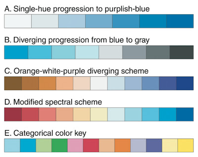
Here are some examples of sequential, divergent and categorical colormaps:
Usually, anomalies are plotted with divergent colormaps and other variables plotted with sequential ones. However, sometimes it makes most sense to plot temperature with a red/blue differential colormap. Just make sure that the red color corresponds to the warmer colors! Choose a colormap wisely so that it highlights the important parts of the data.
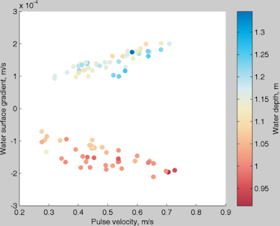
Eleanor Frajka-Williams (one of my figure design gurus) has chosen colormaps that she always uses for the same variables: blue to yellow for salinity, red to blue for temperature, brown to green for oxygen, and light green to dark green for chlorophyll. Here's an example of one of her figures. All of the colormaps are from colorbrewer:
Here's an other example that shows why the jet colormap is so bad. Look at how different it is from the gray colormap.
Here, we see that in the panel on the left where there is a perfectly linear gradient, the jet colormap makes it look like there are many different "levels." In the second panels, even though the gradient has a jump in the middle, it can't be seen in the jet colormap. The right two panes show other differences in the appearances of the two colormaps. This example comes from a great article by David Borland and Russell M. Taylor II called Rainbow Color Map (Still) Considered Harmful.
Another thing to consider is whether to use a discrete or continuous colormap. See how different the following two examples are even though they have the same color limits.
Finally, Eleanor gave me an example of a very different colormap that is useful for highlighting eddies and small scale variability.

(4) Colorblindness
When using colormaps like jet, many people who are colorblind have trouble seeing the colors. The following figure shows two colormaps and how they are seen to people with the most common type of colorblindness.

Just another example of why it's good to use other colormaps besides jet. Good colorblind information can be found on the web. There are even sites where you can load in your figures and it will display what the figure will look like to colorblind people.
Add a label to a colorbar in Matlab
I find myself Googling for this one every time I need to label a colorbar in a Matlab plot.
To add a label to your colorbar:
h = colorbar;
ylabel(h, 'Water depth, m');
We'll cover stuff like this in our next Figure Club meeting on Matlab tips and tricks.
To add a label to your colorbar:
h = colorbar;
ylabel(h, 'Water depth, m');

We'll cover stuff like this in our next Figure Club meeting on Matlab tips and tricks.
Thursday, April 12, 2012
Meeting recap: The Elements of Graphing Data
On 29 March, we discussed the first and second chapters of Cleveland's The Elements of Graphing Data, which gives much advice on graphing techniques and best practices. Some of the topics we discussed were:
- Visual clarity, which is the idea that when making a figure, one should strive to make the data stand out and avoid superfluity in your graph. This means things like ensuring data points aren't buried by trend lines, axes, labels, or other forms of clutter.
- A clear understanding of a graph's purpose, by way of putting the conclusions from which you want the reader to draw in graphical form and making captions comprehensive and informative. A good caption should describe everything that is graphed in the figure, draw attention to the important points, and describe the conclusions to be drawn from the graph.
- Aspect ratios and the idea of banking to 45 degrees. This is the idea that humans are best able to estimate rates of change in graphical data when the average slope from point to point is 45 degrees. Making your figure dimensions to bring the plotted data close to this is probably a good idea.
- Scales, and the appropriate choices of tick marks and scales to compare data between graphs.
Some good resources for general scientific figure creation and examples, both good and bad, include:
along with classic books like Tufte's The Visual Display of Quantitative Information and Cleveland's The Elements of Graphing Data.
Creating good scientific figures is difficult even for the best scientists. In Spring 2012, a few oceanographers from the University of Washington decided to start talking about figure design every week with the goal of improving our scientific figures. This blog is a place for design ideas, links to helpful websites, good and bad figure examples, MATLAB tricks, and anything else that might help us design better figures.
Subscribe to:
Posts (Atom)