(1) When to use color, or the importance of gray
Here are two examples of figures I made that were originally in color, but I converted them to black and white because my advisor wouldn't let me have any color figures in the paper. (I'm using my own figures because I don't have before and after versions of ones made by other people. If you have an example, I'd love to post it too!)


Often it's nice to use color in order to add more excitement to a figure for a presentation or poster, but when you're limited with color for print material, there are often options in black, white and gray. You may be surprised, sometimes the black and white figures look better!
(2) Colors for line plots
How many times have you been listening to a talk and the speaker has apologized that you can't see the lines in their plot? Using cyan, light green and yellow is often disastrous. Similarly, using red and magenta or dark blue and black means that the audience can't see the difference between lines.The default colors in MATLAB are often not good choices in a presentation because it is too hard to see some of the colors and some of them are too similar as seen below:

Here an example where there are just too many colors to be able to see the difference between the lines:

One of the things that can help in a line plot to make the colors more visible is simply to makes the lines thicker. Also, it helps to change the MATLAB default colors so they are darker and more distinguished from each other.

Here, the colors have the following RGB values:
1. darkred = [127.5 0 0];
2. red = [237 28 36];
3. orange = [241 140 34];
4. yellow = [255 222 23];
5. lightgreen = [173 209 54];
6. darkgreen = [8 135 67];
7. lightblue = [71 195 211];
8. darkblue = [33 64 154];
9. purple = [150 100 155];
10. pink = [238 132 181];
(Note that these need to be divided by 255 before using them in MATLAB.) The yellow is probably still not good to use because it's too light and a few people in the meeting complained that they couldn't see the difference between red and dark red. Experiment when you're making your own plots. Often good combinations can be found.
One really cool idea suggests picking colors that vary both the hue and the saturation across the color wheel. (Unfortunately, I lost this link.)

Furthermore, if you're a real color nerd, there are numerous sites where people share their color schemes that they think go well together. These can be an interesting places to find color combos:
www.colorschemedesigner.com
www.colourlovers.com
(3) Colormaps
A great source for colormaps: cpt-city. Thanks Nick for showing me this! I'll definitely use it in the future when I want colormaps for... well, just about anything.
Also, colorbrewer2.org is really cool. There they have both divergent and sequential colormaps. There is an accompanying matlab file from the central file exchange.
Here are some examples of sequential, divergent and categorical colormaps:
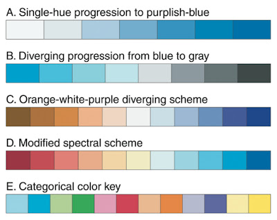
Usually, anomalies are plotted with divergent colormaps and other variables plotted with sequential ones. However, sometimes it makes most sense to plot temperature with a red/blue differential colormap. Just make sure that the red color corresponds to the warmer colors! Choose a colormap wisely so that it highlights the important parts of the data.
Eleanor Frajka-Williams (one of my figure design gurus) has chosen colormaps that she always uses for the same variables: blue to yellow for salinity, red to blue for temperature, brown to green for oxygen, and light green to dark green for chlorophyll. Here's an example of one of her figures. All of the colormaps are from colorbrewer:

Here's an other example that shows why the jet colormap is so bad. Look at how different it is from the gray colormap.

Here, we see that in the panel on the left where there is a perfectly linear gradient, the jet colormap makes it look like there are many different "levels." In the second panels, even though the gradient has a jump in the middle, it can't be seen in the jet colormap. The right two panes show other differences in the appearances of the two colormaps. This example comes from a great article by David Borland and Russell M. Taylor II called Rainbow Color Map (Still) Considered Harmful.
Another thing to consider is whether to use a discrete or continuous colormap. See how different the following two examples are even though they have the same color limits.


Finally, Eleanor gave me an example of a very different colormap that is useful for highlighting eddies and small scale variability.

(4) Colorblindness
When using colormaps like jet, many people who are colorblind have trouble seeing the colors. The following figure shows two colormaps and how they are seen to people with the most common type of colorblindness.

Just another example of why it's good to use other colormaps besides jet. Good colorblind information can be found on the web. There are even sites where you can load in your figures and it will display what the figure will look like to colorblind people.
Hi Sally,
ReplyDeleteI came across your post and really liked the colormap in the graphic meeting-recap-colors-in-figures.html Do you have the MATLAB colormap file for this particular colormap? Thanks.
vizziee
Hi Vizziee,
DeleteI don't know which one you mean. If it's the second figure (headland eddies) you can find the matlab colormap here: http://www.mathworks.com/matlabcentral/fileexchange/17555-light-bartlein-color-maps.
I hope that helps.
sally
Hello,
ReplyDeleteDo you know how I can produce the colormap from the small-scale variability plot? The built-in contouring is really cool.
Thanks!
Joe
I like the idea of varying hue and saturation that you provide an image for. I found the corresponding link: B. Wong, "Colour coding", Nature Methods volume 7, page 573 (2010)
ReplyDeletehttps://www.nature.com/articles/nmeth0810-573#f2